Button
Buttonコンポーネントは、ユーザーがクリックすることで指定された操作するためのコンポーネントです。色、サイズ、形式(ボタン、送信)をカスタマイズが可能です。
基本的な使い方
import { Card, Form, Flexbox, Button } from "@basemachina/view";

const App = () => {
  return (
    <Card>
      <Form
        onSubmit={() => {
          console.log("clicked");
        }}
      >
        <Flexbox direction="col">
          <Button type="submit" title="送信" color="blue" />
        </Flexbox>
      </Form>
    </Card>
  );
};
export default App;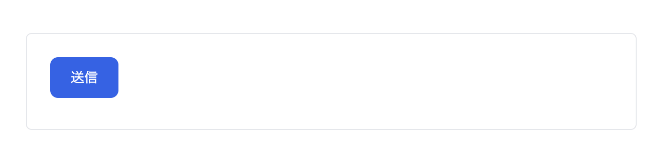
詳細なインターフェース
| 名前 | 説明 | 必須・任意 | デフォルト値 |
|---|---|---|---|
| title | ボタンのテキストを指定します。 | 必須 | なし |
| color | ボタンの色を指定します。blue、red、whiteの中から選択可能です。 | 任意 | white |
| size | ボタンのサイズを指定します。xs、sm、md、lg、xlの中から選択可能です。 | 任意 | md |
| disabled | ボタンが無効化されているかどうかを指定します。trueの場合、ボタンはクリックできません。 | 任意 | false |
| type | ボタンのタイプを指定します。buttonまたはsubmitを選択可能です。 | 任意 | button |
| onClick | ボタンがクリックされたときに実行する関数を指定します。 | 任意 | なし |